More to follow, but for this new project I want to update the Ministry Of Sound logo. This hasn't changed since I was buying mix tapes in my late teens! I have a fondness for the brand but I think it has lost its way and become far more downmarket and corperate. This wasnt at all how it started out and I think a refresh is well overdue.
PS.
This is the first compilation they issued, from 1993, This shows how little has changed in the graphics, and sadly how much has in the credibility of the music (Tony Humphries is a highly respected american house DJ whose carear started in the 1970's!) As contrast, earlier this year MoS released a CD of 'running tracks' yes, music to jog to, attaching the same logo to that is abandoning all underground musical credibility.
Monday, 26 April 2010
Saturday, 10 April 2010
Collaborative Brief Evaluation
This evaluation looks back at the creative contract we filled in at the start of the brief and compares this to how things actualy turned out
What are your specific areas of creative interest in this brief?
Why have you chosen to work with your creative partner?
I wanted to work with Mille because I knew she was a talented illustrator and I thought our skills were quite different and so could complememt each other quite well. This I still think is true, but the way the brief panned out meant that as Mille could illustrate far better than me, I was left doing the concept and copy-writing the slogans, this was quite tough on this particular brief, harder than we both expected at first. I think perhaps we were a little nieve in taking on the engage brief as it was a very advertising style brief. We initially thought we could sort out the concept in a few days then we could both get on with design work, this wasnt how it happerned at all.
What are your specific areas of creative interest in this brief?
I never actually got to do many of the things I am actually good at doing during this brief, and almost none of the things I planned to do at the start. This was actually very frustrating, I know I can come up with concepts and creative ideas, and make design direction decisions but these arnt the things I like to to all the time. We got far too bogged down in the concept stage of this brief and it felt like two weeks of going round in circles scribbling on scraps of paper. The only actual design I did for this brief was the submission board layouts.
What specific non-design skills do you have to offer in relation to your chosen brief? How do you intend to use them?
I think I did get to use far more non-design skills than actual design skills in this brief. I defiantly used decision making and problem solving abilities. I also took on much of the concept development and copywriting, this I found fairly torturous to be honest. We both kept a relaxed, level headed approach to the brief even when it wasn't really progressing in the direction we had hoped, so in many ways the collaboration was a success.
Roles and responsibilities. . . etc
Looking back at this, we were very loose in defining these initially, but we found it quite easy to divide up the work and agree on things along the way. I think neither myself or Mille did our best work during this brief, but I think this perhaps more to do with the difficulty in nailing a concept rather than a reflection on the working relationship.
On balance, the collaboration was a success I feel. The result, although not fantastic, is not a bad solution to a tough brief and was (another) learning experience.
Monday, 29 March 2010
Engage Mutual, final YCM submission boards
The final boards I designed with Mille's illustrations. The tag-line I finally came up with fits quite well I think, its just a shame I didnt have this sooner. The 'You and Us' tagline we worked really didn't explain anything so I changed to using 'Together on lifes journey' Not perfect, but at least it hints at mutuality and also ties in with the life assurance and children's bonds the company sells. Its a positive message and I think it does fit well with Engage's brand values and the way they wish to promote the company.
board 1
boards 2+3
boards 2+3
Remember to show your workings out...
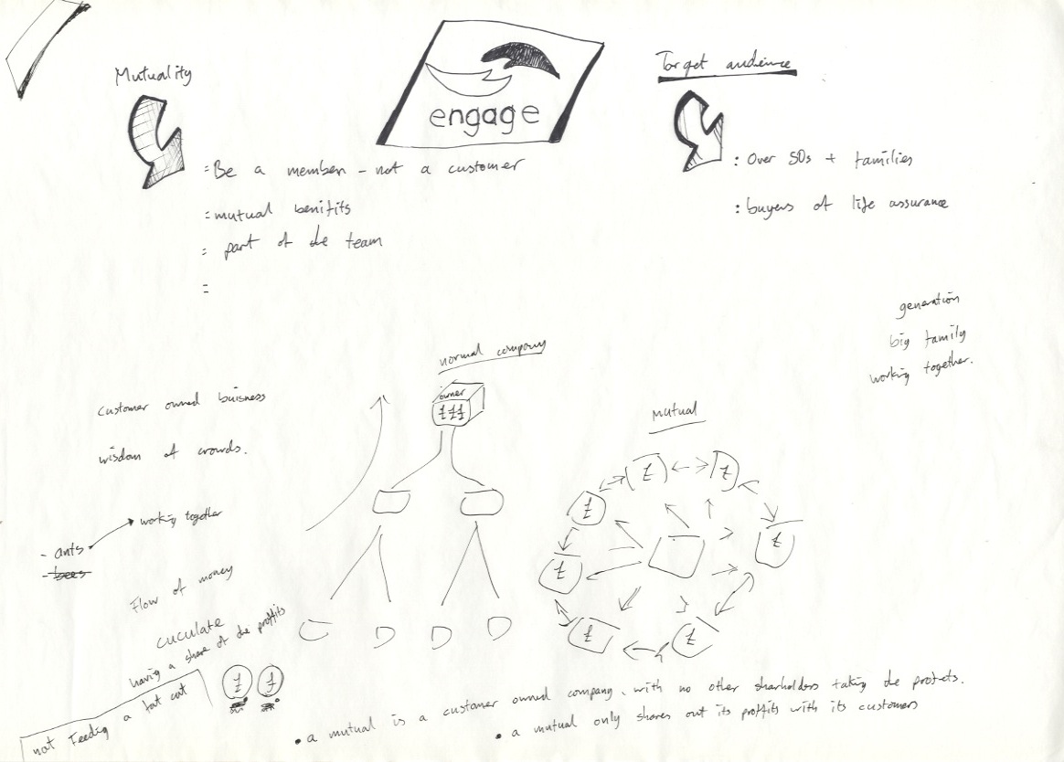
Ah.... this brief gave a fair few headaches. I don't normally post much rough work and brainstorms but for the way this brief was solved, it was integral. I accidentally stumbled into the world of advertising and copy-writing, this was a sharp learning curve for me and defiantly demonstrated the skill in this work which I have unfairly overlooked in the past. Ideas and slogans can be simple, but forcing one out to meet a challenging brief certainly isn't. As Mille was doing the illustratery side of this brief, it was my task to sort out the concepts and ideas and to get the right slogan to tie everything together.
Ok so here are some scans from my workings out, together with some of Mille's illustrations which may demonstrate the difficulty we had in honing the concept.
Fat cat test illustration
Ok so here are some scans from my workings out, together with some of Mille's illustrations which may demonstrate the difficulty we had in honing the concept.
Tug of war idea, to show working together/mutuality
tug or war test illustration,
Serving Idea, to show the company exists only to benefit customers
Serving, test illustration
Giant fat cat/Giant pie idea. To distance the company from other, more greedy institutions
Our first concept defined, and shot down in the first crit.
After this we had to go back and start again as none of ideas we had up to this point were positively received in the crit session.
'You and Us' idea, to try to get across the idea of the company working for the mutual benefit of everyone.
'You and Us' advert, test double page spread.
Friday, 5 March 2010
Our early concepts and ideas
These are the ideas Mille and myself took the the first crit. We idea we had was to make some web based animations to explain that the company (Engage) is a mutual and how this can benefit customers. We worked together for to make these, I came up with the concepts and tag lines and Mille did all the illustrations.
[pics to go here]
We were actually quite pleased with the start we had made, but the feedback from the crit was unfortunately not very positive. I felt I didn't present our ideas well and the main criticisms were that we hadn't clearly defined the customer that we were aiming these at, and the animations didnt explain 'mutuality' at all. This is disappointing in a way as we now have to take a step back to re-look at how to tackle this brief. Also the colours were quite heavily criticised, we just used the colours straight from the engage logo but this is something we clearly need to think more about.
[pics to go here]
We were actually quite pleased with the start we had made, but the feedback from the crit was unfortunately not very positive. I felt I didn't present our ideas well and the main criticisms were that we hadn't clearly defined the customer that we were aiming these at, and the animations didnt explain 'mutuality' at all. This is disappointing in a way as we now have to take a step back to re-look at how to tackle this brief. Also the colours were quite heavily criticised, we just used the colours straight from the engage logo but this is something we clearly need to think more about.
Wednesday, 24 February 2010
Tuesday, 23 February 2010
Sunday, 14 February 2010
End of module evaluation OUGD202
1. What skills have you developed through this module and how effectively do you think you have applied them?
The main skills have to be learning and using Adobe After Effects to create motion graphics. I have enjoyed the challenge of getting to understand how this program can be used effectively. I feel my skills have developed quickly and I have been able to apply this to my work produced.
Storyboarding is something I have done before in my video elective so I understood the role these have in planning sequences. My own boards are rough to look at but they are extremely useful for getting a series or a sequence down on paper so I don't have to remember it in my head, so in that way I have used these effectively.
2. What approaches to/methods of research have you developed and how have they informed your design development process?
The research for this module has roughly been split between finding resources to help me develop my After Effects skills, and research I did into idents and gangsters that I did to help with my movie season brief. I borrowed a couple of books from the college library and watched countless tutorials on CreativeCow.net to pick up After Effects skills, something I have found genuinely interesting. YouTube and TV-ark.org.uk have been great for finding examples of idents and After Effects work. Out of 100's I looked at there were a few key clips I found which I blogged, these defiantly informed my work and hopefully that is clear to see.
3. What strengths can you identify in your work and how have/will you capitalise on these?
The main strength I found during this module is that I enjoyed the process of creating work in After Effects. This is certainly a program I will continue to use. I do like graphics that move in 3D space and I have been exploring this for most of the module. I think its a fascination from when I was young and I had to go to an arcade to play early 3D video games, these seemed far more exciting than 2D sprites at the time but are now ubiquitous and have lost that magic to a certain extent. I wanted to re-capture that 'wow' feeling in the way my graphics could move.
4. What weaknesses can you identify in your work and how will you address these more fully?
I think my concepts were not particularly strong for the film season brief. I think getting to grips with After Effects distracted me from developing ideas more completely. I think now I have learnt far more in After Effects, next time I wont feel the need to experiment in the program quite so much, so I can go back to experimenting with concepts and ideas more. Now I know certain things are possible in the program it gives me a far more informed starting point on which to develop work, from this point I feel my motion graphics work can only improve. My DVD also could have been more, I dont think I had the will to learn DVD studio to the same extent as I learnt After Effects in this module, but I do want to come back to this and do more with interface design in future.
5. Identify five things that you will do differently next time and what do you expect to gain from doing these?
1) More planning, more concepts and more ideas worked out before I move into After Effects next time.
2) Better DVD interface design, again a stronger concept would have helped here, I think now I have done this once, I could do something far better the next time. This module has been quite an intensive learning experience, and the outcome of the DVD perhaps doesn't reflect on the effort put in. I didnt get on as well with DVD studio pro as I did with After Effects.
3) Try not to work on After Effects too late into the early hours, its probably not reflecting well on me coming in at 28mins past 9 with a cup of coffee looking knackerd. But than I never have been a morning person.
4) Stop fiddling with stuff. Too many times I have wondered 'what if I move the camera then bring in another spot light which pans the the left....' then another evening disappears! I need to be more disciplined with this as I could have spent the same time creating whole new idents or exploring a new concept.
5) Probably I wont do kinetic type again, you have to adjust and watch things over, and over, and over to get them to be effective, you get sick of them and lose objectivity. Also the pacing of the speech dictates the pace of the graphics to such an extent I found storyboarding these text sequences to be pretty useless, sometimes you get four words to animate in less than a second, that cant be planned on paper because you can view the paper for as long as you want, so you cant tell if something will be readable and effective in 4/10 of a second.
Thursday, 11 February 2010
Final, finished idents!
Ok these aren't much different from the last ones posted, but they do need to be up here as a record of the final versions that made it onto my DVD. The main changes are the endings. I have added the TCM logo to all: on the same screen as the film title, or after the film title on a couple where I had slightly more time to play with. Some of these endings are deliberately different to add variety to the set, but should be close enough so they all should look like they belong together.
Enjoy! :)
Enjoy! :)
Wednesday, 10 February 2010
Finished DVD Schematic
Now my DVD is complete I can post up a final schematic. I was pleased that the rough plan I worked out (see earlier blog post) proved to be workable, and could even be simplified further. I wanted to keep my interface design very basic because I just personally hate having to needlessly hunt in menus for things. Its so straight-forward my mum could probable use it (I will be sending her a copy so lets hope so).
The main thing that has changed is the animation sequences, they blend seamlessly into each menu design so I think this has been very successful. They arnt strictly necessary but the DVD would be very plain without these adding a bit of visual excitement.
Monday, 8 February 2010
DVD menu tester animation
Now my idents are done I can turn my attention to the DVD interface. The idea is to reuse (re-appropriate) graphics from the film season brief, but as mine is (almost) purely text I didn't have much to go on. I decided the best solution would be to design another type-based animation in the same style of my movie pieces. This can be played as soon as the DVD is loaded and then become the main menu.
I have done another test piece. There is still a few things I want to try in after effects before this module is over so I am using this as a test bed for more experimentation rather than do something the same as I have already. This is using per-character text animation, something quite complex that I have been looking at on creative cow (video tutorial).
Sunday, 7 February 2010
Another TCM ending
Almost forgot about these. These are the ending thingies that are going onto me idents. TCM (Turner Classic Movies) turned into TGM (Turner Gangster Movies) for the film season. These need to be short and snappy as I have about 1.5 seconds to fit these onto the end of my idents, this is probably not enough time but I will see tomorrow how (if) its going to work. If not I can just do a static logo.
more ident progress
At last these are pretty much finished. The only thing that needs adding is the TCM logo animations at the very end. Unfortunately I left these at college so I can't add them today. I have added music from each film to round off the end of every clip so there isn't silence after the quotes. This was a pain to find all the songs, and edit them to fit.
Goodfellas. I have used a new sound clip thet included the song starting as it does in the film, apart from that I havent changed much in this one.
Casino. Now with some music added at the end, I did do some lighting effects to this but then decided it was better without, yes thats the problem when you start fiddling with something.
Sexy beast. This one I have done more to. I have decided to change this to the black background to match the other idents, and also I decided it was too long so I have chopped off the start of the talking. Music added as well which works really well on this one.
American Gangster. I spent a lot more time on this one than any of the others. I didnt like this one having a white background when all the others are black but I wanted to keep the typewriter feel so I have done quite a bit with lighting here. I start with black background with white text, then switch to a spot-lit white background then fade back down to black. I am liking this a lot better now. Music also added at the end.
Friday, 5 February 2010
Finished ident..
Or is it? Well not sure to be honest, I am pretty sick of it now as I have been working on it so long. Its got to the stage where i'm note sure if the chages I am making are improving it or not so I thought I better stop here for now and work on another of the five. Well anyway here it is, a full 10 seconds at last, but you tube will have knocked a bit off the start and end, I forgot to put handles on it. I still need to adjust the audio levels of the two samples to match also.
Subscribe to:
Posts (Atom)