Showing posts with label Flatland brief. Show all posts

Monday, 22 November 2010

Finished Flatland poster

Finally done, printed full scale 90x90cm, after yet more little changes. I did a test print on an ink jet printer yesterday and I was really unhappy with the colours, nothing at all like the laser print outs I was working with. The colours looked far too bland and grey so I changed the colour mixes I was using and also looked at an alternative with a blue/red mix. In the end I couldn't decide so I printed both, but seeing them printed it was the blue and red one that I liked better so that will be the final version. I also corrected a few minor typographical issues, little details that would probably only bother me but I wanted this to be a piece I could be happy with so it was worth the effort. Overall this is the biggest and most complex piece of printed work I have ever done so I am actually feeling a sense of achievement completing this.


Friday, 19 November 2010

Flatland: final test prints (probably)

I think the design for the giant poster is just about finished now. I experimented quite a bit with the colour but none were beating the grey version so I decided to use the overlays to build up a grey when its overprinted. Unfortunately the laser printer isn't reproducing this accurately so I may just have to hope it works when printed, it should do.

To explain the green colour is made from 8% yellow ink, 8% cyan + 4% black. The purplish colour is 8% magenta and 4% black. So (and this is the clever bit) when combined in the overlay section it adds together as 8% yellow, 8% cyan, 8% Magenta + 8% black = Grey!

The main text is 100% black and the title is 40% black


Flatland Typography

This brief is a typographic (ISTD) brief so I do want to make sure the typeface decisions I am making are carefully considered. I have found the style I want using a traditional serif font but I wanted to test more to see if I can give the design an extra edge, again this is all in the detail, but as the font will be so big a wrong choice will stand out, and a good choice will look fantastic. I dont want to customise a font for this as there are many great faces out there that will work for this but I will kern each letter in the final design.


Font tests, from top left clockwise: Cochin, Adobe Caslon pro, Adobe Garamond Pro, Hoefler Text, Sabon, Century Schoolbook.

My preference was Cochin and a few other people I showed these tests pointed out this one as well so thats decided. I havent used this font before so I looked it up to find out a little more. Adobe have a nice info page on it click here . Its French and designed in 1912 so its perhaps a little new for Flatland but only by a few years. Its got a traditional look with a little twist that I feel is perfect for this project.

Flatland Brief, final design direction

I'm really pleased that finally my experimentation has paid off and think I have an interesting solution to the giant poster design. I was constrained by the maximum width the digital printer can handle (900mm) so I was thinking of extending the length to about 1400mm to comfortably fit in the whole book at 9pt text. Now I have decided to sacrifice the point size slightly to make it a square format print (900x900mm) After I did this it all seemed to fall into place, I made shapes of various sides, from a triangle to a 12 sided polygon and arranged these in a grids. this still looked too 'flat' so I copied the arrangement and offset it to create a slight illusion of depth. This is looking far far better than my previous versions and I love the simplicity of this approach, (why am I finding the more I refine a design, the less there is actually in it?)


This is a full scale print made from tiled A3 sheets I assembled in our studio. I still wasn't sure on colour choice at this point so I just used greys for this but it was still quite effective. The shapes looked best if they don't align exactly to the text columns I found, I settled on a 6x6 grid for the shapes and 10 columns of text, this gives a nice symmetry and a nice overlay effect.   

Thursday, 18 November 2010

Flatland brief layout testers

These are test prints of ideas for the layout for the large scale Flatland 'book on a poster' idea. I am still keen to use an overprinted style for these. I think this will work well on this large scale (i'm thinking of approx 1300mm X 900mm) because it draws you closer to see if you can read the small text. I do want all the text to be readable, though I'm not expecting someone to read this from start to finish, its a display piece; primarily designed to intrigue.


I have done many experiments with different fonts for this brief to get the right feel, these are just the ones that made it as far as a test print out.


 Testing a section full scale in white text over dark teal and gold
Different font and more condensed layout, this is a very dark overprint on the text, its still just readable up close but looks completely knocked out from a distance.

Wednesday, 3 November 2010

Flatland idea Layout tester

Ok I did this the other week but I have not been sure what I feel about this direction so I havent blogged this until now. The idea behind this is a giant poster (90cm by 180cm) with the entire text of the book on one side in 8pt Caslon. This was a tester I did just on two sheets of A3 to get the feel of how it would look


In many ways this would work and answer the brief but something was nagging me about it. I have now read most of the book and have a better feel for the text, and this is making me question the need to have this readable in my outcome. The ideas in the book (and this little rough illustrations) are far more interesting than reading the text as a whole. Doing this tester made me realise how interesting this tiny text could look, amazingly you could (just) still read it. I am now wondering if I should explore this, and use this small dense text in layouts as a sort of illustration on the themes in the book...

Thursday, 21 October 2010

a couple of briefs (re)written up

To clarify some points that came out of my crit this morning I have looked at tightening up my briefs and putting them up on my blog here. I have re-written two so far and will think about if I should re-write the ISTD briefs in bagd format.  this may be a pain, as if I can only find them as an expanded text pdf I would have to completely re-write them. For now I will post up the briefs as they stand. They are quite well written so I am happy to work from them as they are.


Alpha Road, band brief (live)
Rapid fire competition response brief, the only one I haven't started yet
ISTD channel X (became my GoTv brief)
ISTD Flatland brief


Tuesday, 19 October 2010

My briefs proposal (draft3)

Just an update to show the briefs that I am currently tackling, click to read.


Tuesday, 12 October 2010

Flatland brief starting point


I think this is going to be a very interesting brief, I still dont know exactly where it will go but as all my other briefs are quite tight in the outcomes I feel this is actualy a good thing at this stage. The brief is very simple, to design a new edition of the book 'Flatland' but this needent (and probably shouldnt) be in the traditional format of a book. The brief is for ISTD so it needs to be typographically based, which suits me very well.

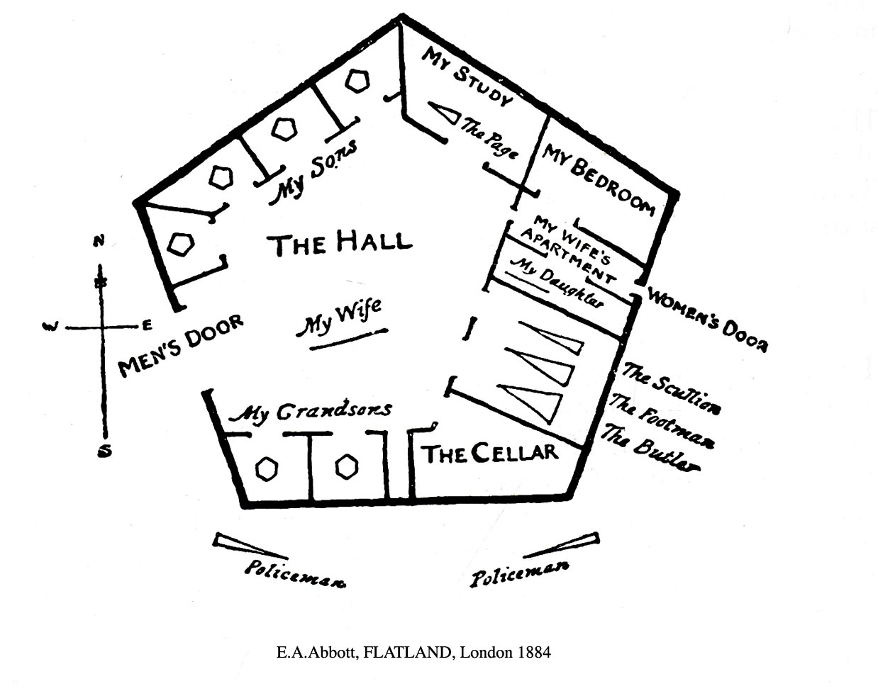
The book plays around with the ideas of dimensions, being narrated by a two dimensional square from flatland who visits both a one dimensional world (pointland) and our 3d world. Interesting stuff but also it, being written in 1884, is a satire on then contemporary Victorian life and class hierarchies in society.

The book in its first edition comes with some lovely sketched illustrations and cover which are also great starting points for me.