
Showing posts with label Alpha Road brief. Show all posts
Showing posts with label Alpha Road brief. Show all posts
Saturday, 4 December 2010

Alpha Road t-shirts mockups
Finally got round to designing a few t-shirts for the band. I used a tee mock up kit just using graphics I have already developed but in a more simple way. They are simplified so can be printed cheap as a one colour tee or screened. I wanted to use colours close to the ones I used in the CD design but I have toned them down a bit also added a grey shirt


Sunday, 28 November 2010
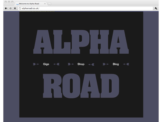
Alpha Road site mock-up
The CD covers are just about done now but I also wanted to do a few other bits of design for the band, so these are two directions for a website design using the graphical style I have developed for the band.



Friday, 19 November 2010
Alpha Road product shots
I now have the designs for the CD cover/posters finished and printed so the opportunity to learn a bit more about taking good product shots came at the perfect time. It turns out its quite simple but its all about knowing how to use the correct lighting. I have only ever used studio flash lighting before so it was great to learn how to use constant lights correctly.
I have spent some time (probably too long) tweaking both version of the design now. I finally got the text and copyright info off the band for the backs, but then I decided to completely redo the typography after speaking to Graham, its all about the fine details so I hope this is noticed!
 'My version' Front

 Folded out
(the CD sits in a slit cut inside, its designed but I'm having trouble getting it printed so I will rephoto when I have it.)

'Band Version' front
 Back
Back
 Folded out
 Reverse side
 Poster side
I have spent some time (probably too long) tweaking both version of the design now. I finally got the text and copyright info off the band for the backs, but then I decided to completely redo the typography after speaking to Graham, its all about the fine details so I hope this is noticed!


Back

(the CD sits in a slit cut inside, its designed but I'm having trouble getting it printed so I will rephoto when I have it.)

'Band Version' front


Thursday, 18 November 2010
Alpha Road colour tests
I think the basic design for the two versions is now there so I am now testing and refining. Choosing colours is one of the things I find the hardest in the design process. It is so subjective but also its makes such a massive difference to the successful outcome of a design, even to the extent of making of breaking a design I think.


Tuesday, 16 November 2010
Last weeks progress crits..
Not blogged till now, oops, anyway the crits were positive and I got quite a bit from them, mostly confirming my own thoughts but sometimes thats all thats needed. I hadn't done as much new work that I would have liked because catching up with my dissertation took two full days out of the week, its going to be a juggling act from now onwards between graphics and dissertation unfortunately. Anyway enough excuses. these are the sheets I prepared showing the status of my current briefs as of that point.


Wednesday, 3 November 2010
Alpha Road Progress
I sent Tom some of the ideas I had done for the band and thankfully he sent an email back saying he loved them! I was surprised that the one he liked best was the ultra bold text layout, I didnt think it really had the feel they were going for in their music but maybe this contrast will work for them. I have taken two ideas further, this one and the arrows text which was my favourite. They also liked the idea of having a folded poster as packaging for the CD so I have done a little experimenting on this.


As a poster fold-out. I'm still not sure how the CD would be held inside, the cheapest way would just be a small sticker to hold it all shut probably.


The Arrow text idea as a fold out, still needs refining a bit, I'm not happy with the front cover panel, I wont use this font again for this idea I have decided. It will look interesting as a poster when done I think.
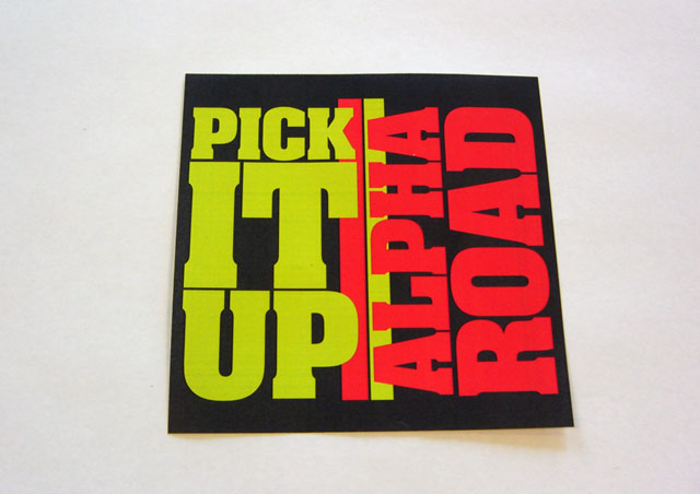
The ultra blocky text idea refined: Tom commented the band name and the title could be mixed together in my previous layout so I have used a different orientation for each now as well as the different colour, works better I think. This would be a design for the front of a simple card slip-case


The Arrow text idea as a fold out, still needs refining a bit, I'm not happy with the front cover panel, I wont use this font again for this idea I have decided. It will look interesting as a poster when done I think.
Friday, 29 October 2010
More Alpha road testers
An update on this brief, I have done some more experiments for the style for Alpha Road. This is a test for typography made from the negative space from arranging arrow shapes (pointing up of course) This would be used as the fold out poster I am planning for the CD holder.


And a couple I did the other week that didnt get blogged:


Thursday, 21 October 2010
a couple of briefs (re)written up
To clarify some points that came out of my crit this morning I have looked at tightening up my briefs and putting them up on my blog here. I have re-written two so far and will think about if I should re-write the ISTD briefs in bagd format. this may be a pain, as if I can only find them as an expanded text pdf I would have to completely re-write them. For now I will post up the briefs as they stand. They are quite well written so I am happy to work from them as they are.
Alpha Road, band brief (live)


Alpha Road, band brief (live)

Rapid fire competition response brief, the only one I haven't started yet

ISTD channel X (became my GoTv brief)

ISTD Flatland brief

Wednesday, 20 October 2010
more Alpha Road tests
I had an idea last night to just see how the cover would look like in big bold typography, very simple but eyecatching. I'm really not sure if this is a good direction for this, but these only took an hour to make so its worth the experiment. Font is Bell Gothic, I like it because it looks both very normal and a little quirky at the same time.


Tuesday, 19 October 2010
My briefs proposal (draft3)
Just an update to show the briefs that I am currently tackling, click to read.


Alpha Road Ideas
I have made a start with my band brief. After a meeting with Tom I had a clearer idea of the sort of style the band are looking for (see design context blog) I am really pleased that they want a clean fresh look because I have been looking at a lot of this sort of style myself. The idea I want is to mainly use white type over a warm colour with some geometrical elements, maybe a bit Saul Bass.
Also I know have the EP title 'Pick It Up' (there wont be an album just yet because not enough songs are ready unfortunately, they want another 3 track EP designed). These are some ideas and tests,


Also I know have the EP title 'Pick It Up' (there wont be an album just yet because not enough songs are ready unfortunately, they want another 3 track EP designed). These are some ideas and tests,


Subscribe to:
Posts (Atom)