Also sketchbook efforts to be scanned in
Tuesday, 14 December 2010
Glayva development
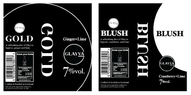
I have refined my designs for the Glayva bottles and come up with more ideas to resolve this brief. I decided to go with a primarily typographic design with black as the main colour, but I also still want to see the colour of the drinks in transparent sections. I also wanted a reversed section of text to be read through the bottle as this is a trick I have seen in upmarket wine and spirit bottles, a good example is on my DC blog.
Subscribe to:
Post Comments (Atom)


No comments:
Post a Comment