Thursday, 18 November 2010

Alpha Road colour tests

I think the basic design for the two versions is now there so I am now testing and refining. Choosing colours is one of the things I find the hardest in the design process. It is so subjective but also its makes such a massive difference to the successful outcome of a design, even to the extent of making of breaking a design I think.


Flatland brief layout testers

These are test prints of ideas for the layout for the large scale Flatland 'book on a poster' idea. I am still keen to use an overprinted style for these. I think this will work well on this large scale (i'm thinking of approx 1300mm X 900mm) because it draws you closer to see if you can read the small text. I do want all the text to be readable, though I'm not expecting someone to read this from start to finish, its a display piece; primarily designed to intrigue.


I have done many experiments with different fonts for this brief to get the right feel, these are just the ones that made it as far as a test print out.


 Testing a section full scale in white text over dark teal and gold
Different font and more condensed layout, this is a very dark overprint on the text, its still just readable up close but looks completely knocked out from a distance.

Tuesday, 16 November 2010

Last weeks progress crits..

Not blogged till now, oops, anyway the crits were positive and I got quite a bit from them, mostly confirming my own thoughts but sometimes thats all thats needed. I hadn't done as much new work that I would have liked because catching up with my dissertation took two full days out of the week, its going to be a juggling act from now onwards between graphics and dissertation unfortunately. Anyway enough excuses. these are the sheets I prepared showing the status of my current briefs as of that point.


Sunday, 14 November 2010

Go Tv sting

I have redefined this brief as a series of short idents/stings to promote the various styles of programming for the channel. I want a level of subtlety and quiet sophistication to them and I want them to all work well as a set. The logo I developed is very strong and geometrical so I want to play with softer movements and transparencies to counter this. I am looking at how Channel Four have done this and its a major inspiration for this project.

This is a tester to try to capture the 'feel' I want, definatly getting close, and I can see how this could run as a set with many variations.

Wednesday, 3 November 2010

Alpha Road Progress

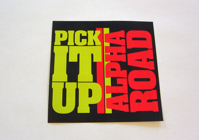
I sent Tom some of the ideas I had done for the band and thankfully he sent an email back saying he loved them! I was surprised that the one he liked best was the ultra bold text layout, I didnt think it really had the feel they were going for in their music but maybe this contrast will work for them. I have taken two ideas further, this one and the arrows text which was my favourite. They also liked the idea of having a folded poster as packaging for the CD so I have done a little experimenting on this.


The ultra blocky text idea refined: Tom commented the band name and the title could be mixed together in my previous layout so I have used a different orientation for each now as well as the different colour, works better I think. This would be a design for the front of a simple card slip-case


As a poster fold-out. I'm still not sure how the CD would be held inside, the cheapest way would just be a small sticker to hold it all shut probably.


The Arrow text idea as a fold out, still needs refining a bit, I'm not happy with the front cover panel, I wont use this font again for this idea I have decided. It will look interesting as a poster when done I think.

Flatland idea Layout tester

Ok I did this the other week but I have not been sure what I feel about this direction so I havent blogged this until now. The idea behind this is a giant poster (90cm by 180cm) with the entire text of the book on one side in 8pt Caslon. This was a tester I did just on two sheets of A3 to get the feel of how it would look


In many ways this would work and answer the brief but something was nagging me about it. I have now read most of the book and have a better feel for the text, and this is making me question the need to have this readable in my outcome. The ideas in the book (and this little rough illustrations) are far more interesting than reading the text as a whole. Doing this tester made me realise how interesting this tiny text could look, amazingly you could (just) still read it. I am now wondering if I should explore this, and use this small dense text in layouts as a sort of illustration on the themes in the book...

Sunday, 31 October 2010

GoTv another test

Another test that I'm not really happy with. I wanted to try some simple transformations of the logo but the the result just isn't what I want at all. Technically its quite clever, but as design its a bit naff, this is a shame because it was a few hours work gone into this, but at least I know now.


Friday, 29 October 2010

More Alpha road testers

An update on this brief, I have done some more experiments for the style for Alpha Road. This is a test for typography made from the negative space from arranging arrow shapes (pointing up of course) This would be used as the fold out poster I am planning for the CD holder.


And a couple I did the other week that didnt get blogged:


Thursday, 21 October 2010

a couple of briefs (re)written up

To clarify some points that came out of my crit this morning I have looked at tightening up my briefs and putting them up on my blog here. I have re-written two so far and will think about if I should re-write the ISTD briefs in bagd format.  this may be a pain, as if I can only find them as an expanded text pdf I would have to completely re-write them. For now I will post up the briefs as they stand. They are quite well written so I am happy to work from them as they are.


Alpha Road, band brief (live)
Rapid fire competition response brief, the only one I haven't started yet
ISTD channel X (became my GoTv brief)
ISTD Flatland brief


Crit questions and feedback

Into the first Crit of this project I was slightly concerned if any of my briefs were resolved enough to make feedback worthwhile but I actually came away with some good positive vibe and some new ideas.

The questiones I asked.

1) Alpha Road Brief: Is this style credible/appropriate for an indy rock/pop band?
2) Flatland Brief: Is the book as a poster idea a good direction to continue with as its still in the early stages?
3) GoTv: Is my final logo ok, and and ideas to use this in idents:
4)GoTv:  Should the font for the channel be close to the logo style or complement it as a contrast in style?
5)Flatland brief: Should I use a more Victorian style for the poster or keep it more contemporary?


General feedback was,

1) The earlier version is, the later big bold type stye is perhaps too dubstep especially in the colours I used.
2) Right direction and idea but needing far more development work to make interesting resolution.
3) Logo fine, play with 3d or shapes interlocking for an ident idea
4) Defiantly a contrasting, complementary typeface
5) A victorian could look tacky, stick to closely related style from the book illustrations


Other feedback:

Get all my briefs written up in the BAGD format asap.
Look at more contextual stuff for a disign direction for the flatland brief.
The GoTv brief is the biggest, dont neglect it.

Nothing really unexpected to be honest, I just need to get of with things at this stage I think.

Wednesday, 20 October 2010

more Alpha Road tests

I had an idea last night to just see how the cover would look like in big bold typography, very simple but eyecatching. I'm really not sure if this is a good direction for this, but these only took an hour to make so its worth the experiment. Font is Bell Gothic, I like it because it looks both very normal and a little quirky at the same time.


Tuesday, 19 October 2010

My briefs proposal (draft3)

Just an update to show the briefs that I am currently tackling, click to read.


GoTv motion test

Not a real ident but a tester to see the logo in motion. I think there are quite a few possabilities for this to now I need to work on ident ideas to really make this something unique.


Alpha Road Ideas

I have made a start with my band brief. After a meeting with Tom I had a clearer idea of the sort of style the band are looking for (see design context blog) I am really pleased that they want a clean fresh look because I have been looking at a lot of this sort of style myself. The idea I want is to mainly use white type over a warm colour with some geometrical elements, maybe a bit Saul Bass.

Also I know have the EP title 'Pick It Up' (there wont be an album just yet because not enough songs are ready unfortunately, they want another 3 track EP designed). These are some ideas and tests,


GoTv logo finished(?)

After another session looking at what I had already done I combined a few of my ideas into this candedate for a final logo design. It meets quite a lot of the criteria I wanted to fill. Its simply, distinctive, different from other TV channels and uses my own custom lettering that I can use to develop a whole font.

This spread has some variation and development of this solution.