This is my first try at making kinetic type quotes for my movie season brief. The story board I worked out wasn't as useful as I hoped because the speech is so fast paced I couldn't fit in most of the stuff I had planned. Despite that, the storyboard did give me a starting point and meant I had a direction to work from even if the result was substantially different. There is actually quite a bit of complex stuff going on in this but most of it happens in a flash. This isn't a bad thing I guess because the result looks snappy, but it did take me a whole day to make and its only 4 seconds long! Partly this is because I made this in a slightly different way to my previous 'fold' clips and I was learning the method. The text in this is made directly in after effects rather than imported illustrator layers, this has advantages and disadvantages. The main advantage is that they stay in a form that is easy to edit within the program, I can change the colour or even the font without having to remake the clip.
Tuesday, 26 January 2010

Saturday, 23 January 2010
Using film quotes
To get up and running with this brief, I have pressed a virtual reset button on my previous ideas and decided to base my 10 second animations around quotes from each film. This should give me a strong starting point with opotunities to add complexity into my peices as they develop. These are the films and the quotes I am thinking about using (some I have picked out two alternative quotes to test).
Goodfellas:
1) As far back as I can remember, I always wanted to be a gangster.
Sexy beast:
1) I am going to have to turn this opportunity down.
No, you are going to have to turn this opportunity yes!
American gangster:
1) My investigation indicates that Frank Lucas is above the Mafia.
2) See, you are what you are in this world. That's either one of two things: Either you're somebody, or you ain't nobody
Donnie Brasco:
1) When they send for you, you go in alive, you come out dead, and it's your best friend that does it.
2) If you're a rat, then I'm the biggest mutt in the history of the Mafia.
Casino:
1) Normally, my prospects of coming back alive from a meeting with Nicky were 99 out of 100. But this time, when I heard him say "a couple of hundred yards down the road", I gave myself 50-50.
2) Running a casino is like robbing a bank with no cops around. For guys like me, Las Vegas washes away your sins. It's like a morality car wash.
I think these are all strong quotes and represent the films well. I can animate kenetic type to go along with these quotes and hopefully come up with a strong set of idents. My next step is to storyboard some ideas.
Crit Feedback and thoughts
My gangster season project is off to a slower start than I hoped. I went into this crit asking for help with my concepts and hoped to come out with a clearer direction. I am not sure I have this yet, but I did come out with a few new ideas to investigate. I am keen to get into aftereffects and start making something, so I am very frustrated that I dont have a clear good concept just yet.


This second feedback is very generic, no real suggestions.

Good points here on finding a 'mood' and 'tone' to work with. I will investigate this and may be the key to moving forward with this. Also comment about simplicity, I think now I excited about the possibilities of aftereffects it has caused me to 'over think' what is needed to create this brief and I have ended up with almost nothing.

This second feedback is very generic, no real suggestions.
Sunday, 17 January 2010
DVD menu, flowchart
This took a bit more working out that I thought it would. For my DVD I want a clear straightforward menu system. I dont want endless menus that you cave to click through because nothing frustrates me more!
This was my first flowchart but I didnt like this as you would have to click through two pages to get to the film season final pieces, also I though I might have too many options in the Silent Movie brief menu because all the finals and all the development is on the same screen.

My second attempt I think will work far better. I have the same structure now for each brief. All my final pieces are now displayed just one click from the main menu and all my development work will be just one further click away. This should be simple and effective, I hope. There will be a back button on each screen to go back up one level, I shouldn't need a back to main menu button, as the main menu will be at most two clicks away.

This was my first flowchart but I didnt like this as you would have to click through two pages to get to the film season final pieces, also I though I might have too many options in the Silent Movie brief menu because all the finals and all the development is on the same screen.

My second attempt I think will work far better. I have the same structure now for each brief. All my final pieces are now displayed just one click from the main menu and all my development work will be just one further click away. This should be simple and effective, I hope. There will be a back button on each screen to go back up one level, I shouldn't need a back to main menu button, as the main menu will be at most two clicks away.

(note, these are mock ups for the structure, not the actual designs, these are yet to be worked out)
Tuesday, 12 January 2010
Saturday, 2 January 2010
More Folding
Over Christmas I have been reworking and refining my 'fold' After Effects pieces, and since I have borrowed some internet today I can finaly blog them.
(I am having youtube issues, these animations should run smother without the jerkiness, I am looking into why youtube does this and how it can be prevented)
The final one here probably communicates 'fold' least well, but its going up because I learnt a hell of a lot making it, you cant just press a button to make a shadow like that you know? All fun stuff though.
I think the box works best, it wasnt half as cool before I had a sudden thought about playing with transparencies, then it quickly became a glass box. The lighting took ages as well but I'm not even going to talk about that!
(I am having youtube issues, these animations should run smother without the jerkiness, I am looking into why youtube does this and how it can be prevented)
The final one here probably communicates 'fold' least well, but its going up because I learnt a hell of a lot making it, you cant just press a button to make a shadow like that you know? All fun stuff though.
I think the box works best, it wasnt half as cool before I had a sudden thought about playing with transparencies, then it quickly became a glass box. The lighting took ages as well but I'm not even going to talk about that!
Saturday, 19 December 2009
After effects: work in progress
This is a bit late but here is the results of some experiments in After Effects. For these clips I have five seconds to comunicate my word (fold). The actual word must be used, with no sounds and limited colours. I'm having more fun than I thought I would learning the program, its not exactly easy but I like the logical way it works. The potential of what is possible to create in this program is actually far greater than I thought at first.
So then, here are some testers I have put up on youtube.com
None of these I consider finished, a couple I will work on to improve, but others I will look again at the concept and re think. Its interesting that getting the timing right can take just as long as getting the movements right on some of these. I did attempt to plan a timeline but I found that timings I thought would work were far from the reality of the pace I needed. I have found it far better to just experiment live in the program to get timings of movements looking good.
So then, here are some testers I have put up on youtube.com
None of these I consider finished, a couple I will work on to improve, but others I will look again at the concept and re think. Its interesting that getting the timing right can take just as long as getting the movements right on some of these. I did attempt to plan a timeline but I found that timings I thought would work were far from the reality of the pace I needed. I have found it far better to just experiment live in the program to get timings of movements looking good.
Friday, 18 December 2009
Fold storyboards
These are the rough workings out I used to help plan my 'fold' animations. They actually arnt that detailed because I mainly used these to clarify things in my own head. As soon as I knew how the animation would work I was eager to go into after effects to make them. With only 5 seconds to use I wanted one fluid movement to illustrate fold rather than try to squeeze too much in. I think this approach paid off and even if looking back at this rough work doesn't show much, they were an important part of the process and functioned for my needs.


Thursday, 17 December 2009


Wednesday, 16 December 2009
Fold, Cold, Tap
Three words from the randomizer I had to communicate quickly to kick off the new module. I cant quite remember but I think we had an hour over lunch to do these, not much longer i'm sure. They arnt spectacular but defiantly blog-worthy.

'Fold' using sugar paper and pritt stick, possibly veering away from 'fold' towards 'crumple' but I quite like this one.

'Tap', I did this one first and had the concept clear in my head but then spent too long searching for suitable images. I'm still not sure if its worked, some people see the word 'Tap' in this and some dont, maybe thats ok but it does somehow look a bit pretentious. Yes he is a real tap dancer by the way, google images told me so.

Saturday, 5 December 2009
Finished work
It's about time I put some finished work on this blog, so first up is my print booklet. This is a 16 page pdf that is best downloaded and viewed in acrobat viewer so you can view page spreads and not just individual pages. Since I submitted this I have noticed the glaring typos and spelling errors, oops.
Next is my 'What is good project PDF' this is a summery of the developmental work for this brief, this was submitted together with finished design boards.
Final Rocket Fuel drink product mock-up photos,


Next is my 'What is good project PDF' this is a summery of the developmental work for this brief, this was submitted together with finished design boards.
Final Rocket Fuel drink product mock-up photos,


Tuesday, 24 November 2009
OUGD201 Module Self-Evaluation
In completing your summative evaluation you should focus on the following areas:
1. your ability to select develop and evaluate a range of appropriate source material gathered through a breadth of appropriate research methods
I feel my research for this module has been successful, both on the 'what is good' brief and for the print booklet. I have mostly use secondary research methods in the module, largely books to learn about print processes and the internet to learn all about space travel and space food. For my graphical responses I used both these methods to learn about 1950's style graphics, especially the typefaces and colours used in this decade. I mostly used primary research to gather opinion from my peers on appropriate design direction.
processes and technologies.
I have learnt a lot about the technicalities of print during the course of the module. I now understand the differences between digital, lithograph, flexo, etc, printing and have an understanding of how to prepare a document ready to go to a printer. Learning about spot colours and the various special finishes available in commercial print was very interesting and is sure to inform my design decisions from now onwards.
I feel I have built on my design development skills and I have refined a way of working that can bring me creative solutions in a more systematic way. I have been using design sheets for visual idea generation and mostly Adobe Illustrator for working up and finalizing these ideas. I am also much happier using indesign to create page layouts. I used this exclusively for my 16 page print book.
4. the documentation, organisation and presentation of your work for this module.
5. the success of your final products in relation to the briefs.For this module we submitted a pdf of highlights from our development rather than all the design sheets for the first time. I was dubious about how this would work, but in reality I was pleased to be able to highlight important moments in my project and have an overall 'neater' record of my working, I feel this has been very successful. I was less happy with my design boards I submitted, while they contained the information I wanted, the design, and particular the execution needed more care and I was disappointed to realize I had run out of time to improve these. My print booklet was more successful. We only had to submit a few double page spreads for this but as I had designed it to be a fairly small format I wanted to print and make it. I think this was worth the extra effort, although the print quality isn't great because it is only a laser printed due to practicality. My final space drink product design worked quite well but actually making and photographing this proved to be unexpectedly difficult. I had to photograph it twice because the silver packaging on a white background was confusing the auto exposure on my camera and compensating for this in photoshop resulted in noise and problems with colour shift. If I was doing this again I would plan for a lot more time for product mockup and photography.
1) Not get ill. Unfortunately I wasn't really very well for quite an extended time during this module and work was left to mount up, causing a rush in the last two weeks when I felt good, the outcomes did suffer.
2) Balance projects better. I think I could have spent more time with the 16 page book, this got sidelined too often while I was working on the 'what is good' brief.
3) Experiment more. I have learnt a lot of print techniques but not really 'played' with them enough, yet.
4) Do things right the first time. Not something I usually have a problem with, but in this module I had to re-do the final product photography and also some page layouts and other design work I had completely messed up and only realized on reflection. More speed less haste.
5) Get my Illustrator skills up to scratch. I am still having far too many "how can I do this" moments which is slowing down my working. I plan to find a book or some internet tutorials to help brush up my skills.
Sunday, 8 November 2009
What is good: All about space food
At the moment my ideas are focused around using space food as my product to design packaging for to answer this brief. To understand what exactly I am designing for I have done more research to learn all about food in space. I will outline what I have found in this blog post.
'Being an astronaut is Good' was the starting point for this brief, but I have found quite a few reasons why space food itself could be considered 'good' even if consumed on earth;
Also see packaging brochure.pdf and this nice tongue in cheek history of space food well worth a read


'Being an astronaut is Good' was the starting point for this brief, but I have found quite a few reasons why space food itself could be considered 'good' even if consumed on earth;
- It is highly nutritious, certainly a space snack would be better for you than a typical chocolate bar.
- All food must have proven long shelf life (one year minimum for ISS food)
- The packaging is light-weight and designed to minimize waste, essential in space, ethical on earth.
- All packaging is tested to be non toxic, even in extreme conditions, including the glues and inks etc.
Also see packaging brochure.pdf and this nice tongue in cheek history of space food well worth a read

NASA space food
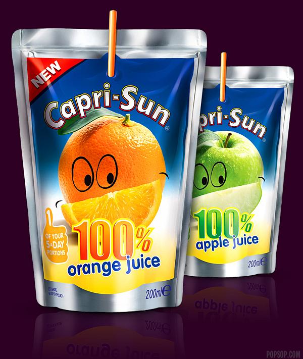
Capri-Sun, this packaging is modified slightly and used by NASA for their own drinks.
Sunday, 1 November 2009
What is good: Space clothing
I have discussed space food in my last posting, clothing is my other main focus of research at the moment. I have found that apart from space suits used for space-walking, the actual clothing astronauts wear day to day on a typical mission is actually quite low-tech. I found full details of the kit Russian cosmonauts use click here , the American equipment is similar. This is good news as I could easily market a t-shirt that could genuinely be used in space. If I decided to use clothing as a product, then I think the way it would be packaged will have the biggest impact on creating interest and making it appear exiting and space age.
So.. I have looked at creative tee-shirt packaging, there actually is a lot of stuff out there,


So.. I have looked at creative tee-shirt packaging, there actually is a lot of stuff out there,

Packaged as meat from Butchrd Apparel

Packaged as a sandwich from The T-shirt Deli

Packaged as explosive by that nice bloke who gave a talk in our college
Of course none of these are remotely space-age but thats down to me to get thinking about!
What is good: ideas and research
Well this project is taking shape now, at least in my own head but I haven't shared much so far on my blogs, so this will be an update posting.
My initial idea that 'being an astronaut is good' caused me some problems when it came to answering 'Why?' There were lots of ways I could take this, but the way I wanted to investigate was that space travel is good because it shows us an optimistic future and expands the horizons for humanity. I have researched the enthusiasm the public in general had for the apollo program in the 1950's and 60's. There seems less interest now in human space travel, but actually it could be a dawning of a new age in human space travel with the advent of space tourism, this time Anyone can go into space (if they have enough money) not just state selected astronauts. So this brings me to the direction for me project: Products that a space tourism company could sell to supplement and create interest in trips into space.
So far I have looked at space food, and space clothing as two obvious directions for products that can be sold for use on earth as well as in space, I think there should also be some sort of promotion attached to these so people could collect tokens, or enter draws for a trip to space with every purchase.
So first up, space food research. I have found plenty of references to actual space food that was marketed to the public in the 60's and 70's. Most notable, the American drink 'Tang' has long traded off links to NASA: details on wikipedia Even more interesting is the story of 'Space Food Sticks'. These were a energy bar type snack developed for use by astronauts. They were also sold to the public and were popular for a while before disappearing from shelves in the late 70's. Interestingly, these have recently been successfully relaunched by a new company and can now be bought online. See history pages at http://spacefoodsticks.com/
Its great to see a product that trades on enthusiasm for human space travel is out there being sold. Redesigning a food product like this to bring it up to date and branding it to a space tourism company is one idea I am developing.

My initial idea that 'being an astronaut is good' caused me some problems when it came to answering 'Why?' There were lots of ways I could take this, but the way I wanted to investigate was that space travel is good because it shows us an optimistic future and expands the horizons for humanity. I have researched the enthusiasm the public in general had for the apollo program in the 1950's and 60's. There seems less interest now in human space travel, but actually it could be a dawning of a new age in human space travel with the advent of space tourism, this time Anyone can go into space (if they have enough money) not just state selected astronauts. So this brings me to the direction for me project: Products that a space tourism company could sell to supplement and create interest in trips into space.
So far I have looked at space food, and space clothing as two obvious directions for products that can be sold for use on earth as well as in space, I think there should also be some sort of promotion attached to these so people could collect tokens, or enter draws for a trip to space with every purchase.
So first up, space food research. I have found plenty of references to actual space food that was marketed to the public in the 60's and 70's. Most notable, the American drink 'Tang' has long traded off links to NASA: details on wikipedia Even more interesting is the story of 'Space Food Sticks'. These were a energy bar type snack developed for use by astronauts. They were also sold to the public and were popular for a while before disappearing from shelves in the late 70's. Interestingly, these have recently been successfully relaunched by a new company and can now be bought online. See history pages at http://spacefoodsticks.com/
Its great to see a product that trades on enthusiasm for human space travel is out there being sold. Redesigning a food product like this to bring it up to date and branding it to a space tourism company is one idea I am developing.

Original space food sticks advert c.1970
Subscribe to:
Posts (Atom)