Wednesday 15 December 2010
Module evaluation
On the whole I feel I achieved a great deal this module. Looking back at the rationale I wrote at the start of module I feel the work I did matched this quite closely. All my briefs have an element of using typography in a considered way and I did a mix of live and competition briefs. My Alpha road brief was the most successful I feel, looking back I think I did quite a large amount of development to resolve this and I am pleased that the band love the final designs. My flatland brief has both pleased me and disappointed me in equal measure. I really like my poster resolution to this but I never found a convincing way to push the brief any further so it is limited in range and scope unfortunately. My GoTv brief also ended up smaller than I would have liked it to be. I was pleased with the overall concept and logo I developed but I never found the time to make as much motion graphics to realise the potential of the brief. This was for various reasons, other briefs demanding my time and limited availability of resources played a part in this, but better project management would have resulted in a more complete brief in this case. Despite this I think the logotype I developed is convincing solution. My Glayva brief was started too late if I am honest. This was the last brief I tackled and would have benefited from another week spent on it. The bottle designs have potential but are not completely realised yet I feel. For the shorter briefs I was focused on meeting a client brief in a tight deadline. The student flyer design was done extremely quickly and was received enthusiastically by the client. The college E-card was extreme challenging to produce because of the constraints of the file various formats (flash,Gif,quicktime etc). I was pleased my resolution was realistic, appropriate, delivered over a range of formats, and completed on time, but disappointed I missed out on winning the commission for this in the end. Overall I feel this body of work is the best I have produced for the course to date, but I can see many areas for improvement, I need to produce quality work faster to achieve more because I cant put any more actual time into what I do, I think everything I did this module took twice as long as what I estimated it would, and even looking back at the work I feel twice as long as it should! This is something I need to address if I want to achieve better work going into the next module, the solution is probably to do more briefs that have definite time constraints, this will stop me 'bending' my self imposed deadlines and spending too much time on everything.
Tuesday 14 December 2010
Glayva Illustrator mockups
I have changed the design again so it looks better actually wrapped round a bottle, (lesson learnt: layout that looks fine flat can look a complete mess curved) and switched to working with 3D mockups in illustrator because the real mockups I were trying wern't going to look convincing enough in the time I had left I felt. Crafting things that take a long time frustrate me intensely unfortunately!
I Forgot to say, This design came from looking again at the original Glayva liqueur bottles for inspiration, I decided it would tie my new drinks back to the brand nicely if I used the shape of the original bottle in my designs. Click to see existing Glayva bottles So I made a repeat pattern of this bottle design using the black and transparent for a section of my design.


3D from another angle
I Forgot to say, This design came from looking again at the original Glayva liqueur bottles for inspiration, I decided it would tie my new drinks back to the brand nicely if I used the shape of the original bottle in my designs. Click to see existing Glayva bottles So I made a repeat pattern of this bottle design using the black and transparent for a section of my design.

I changed this design as the 'VA' in Glayva looked like it was tacked on as an afterthought,


Mockups with a bit of shadow effects, hopefully not looking cheezy?

The designs flat

3D from another angle
Glayva mock-up
I printed out some of my Glayva testers on transparencies to test how they would work on a bottle. This had mixed results but my idea of a section of reversed text that was read by looking through the bottle worked well but is hard to explain in text or photograph.


This is the opposite side, viewing the text through the bottle stretches out the letters optically and mirrors the image. It looks very effective with light shining from the back. I could see this working well in a bar display fridge.


This is the opposite side, viewing the text through the bottle stretches out the letters optically and mirrors the image. It looks very effective with light shining from the back. I could see this working well in a bar display fridge.
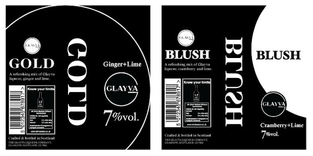
Glayva development
I have refined my designs for the Glayva bottles and come up with more ideas to resolve this brief. I decided to go with a primarily typographic design with black as the main colour, but I also still want to see the colour of the drinks in transparent sections. I also wanted a reversed section of text to be read through the bottle as this is a trick I have seen in upmarket wine and spirit bottles, a good example is on my DC blog.


Also sketchbook efforts to be scanned in
Tuesday 7 December 2010
Glayva Gold custom type experiment
I had an idea for a logo-type using the Glayva 'G' as a starting point for the rest of the letters of 'Gold'. This is the result of these experiments. I don't actually think I will use this in the final bottle designs as the letters I tried to make for 'Blush' in the same style just didn't work at all and I do want the drinks to have a similar branding to each other.
I used the existing logo as the starting point for the 'G' the 'D' is just adapted from a half circle and the 'L' uses a cut section of the 'D'

I used the existing logo as the starting point for the 'G' the 'D' is just adapted from a half circle and the 'L' uses a cut section of the 'D'

Monday 6 December 2010
updated GoTv now&next screen
My latest version of the GOTV motion graphics. I am getting close to the style I want to use now, other briefs have distracted me from completing this one but its almost there now, I just need to roll out this style onto other colours for daytime programming and make variations of the graphics for stings.
Sunday 5 December 2010
More Glayva bottles
More development for my bottles, I still dont think these are there yet, but hopefully i'm getting closer.


Saturday 4 December 2010

Alpha Road t-shirts mockups
Finally got round to designing a few t-shirts for the band. I used a tee mock up kit just using graphics I have already developed but in a more simple way. They are simplified so can be printed cheap as a one colour tee or screened. I wanted to use colours close to the ones I used in the CD design but I have toned them down a bit also added a grey shirt


Friday 3 December 2010
Glayva bottles so far
So far in this brief I have made a start sketching some ideas and developing these up in illustrator. I have decided on the sort of bottle I will base this brief around. A few alcopops use this same bottle shape but I wanted to use a plain bottle with no branding on it so I was constrained a bit in choice but as I do want to make a mock up using an actual bottle I need to be realistic in using something I can get hold of.
So far these are the designs I have been playing around with, I have tried to keep it quite minimal but I dont think any of these are quite there yet so I will keep developing some other ideas. I have adapted the existing Glayva logo into these designs, changing it only slightly so it can take on the colour of each drink.

So far these are the designs I have been playing around with, I have tried to keep it quite minimal but I dont think any of these are quite there yet so I will keep developing some other ideas. I have adapted the existing Glayva logo into these designs, changing it only slightly so it can take on the colour of each drink.

Wednesday 1 December 2010
New brief, Glayva drinks
This is an adaption of the YCN 2011 Whyte&Mackay brief.

I havant got a great amount of time to complete this in but its a fairly straight forward brief so I think I should be able to resolve it into something interesting in the time left. Its a double logo and branding brief with some thought also to how it will be applied to a bottle design. I will probably just use a plain style of bottle because I'm more interested in how graphics and branding can be applied to something generic to give it an upmarket feel. - But saying that I was thinking about the possibility of using frosted glass, rather than clear.

I havant got a great amount of time to complete this in but its a fairly straight forward brief so I think I should be able to resolve it into something interesting in the time left. Its a double logo and branding brief with some thought also to how it will be applied to a bottle design. I will probably just use a plain style of bottle because I'm more interested in how graphics and branding can be applied to something generic to give it an upmarket feel. - But saying that I was thinking about the possibility of using frosted glass, rather than clear.
Monday 29 November 2010
Go TV idents
A quick update for this brief, I'm still playing around using the logo I developed into fairly subtle motion graphics. This is my latest tester:
Sunday 28 November 2010
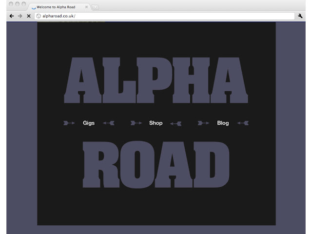
Alpha Road site mock-up
The CD covers are just about done now but I also wanted to do a few other bits of design for the band, so these are two directions for a website design using the graphical style I have developed for the band.


Thursday 25 November 2010
Xmas Card brief (Now with missing apostrophe, oops!)
I have worked up the flash file a bit more and changed the colours, size and font but kept the same basic idea. I have already spent far longer than I wanted to on this so hopefully this idea will be ok. I talked to the technicians about a animated gif version and it is possible but the file size will be quite a bit bigger, around 1MB rather than 150k that the flash file came to.

'Still' version

Edit: GIF version now complete (above). This came in at 2.3MB which is just about acceptable for emailing people. It loops nicely but is jerkier that I would ideally like. Making this work in various formats has been a headache, but I have learnt a lot about the successful delivery of this sort of graphic.
Animated flash version link: http://megaswf.com/simple_serve/78897/
'Still' version
Edit: GIF version now complete (above). This came in at 2.3MB which is just about acceptable for emailing people. It loops nicely but is jerkier that I would ideally like. Making this work in various formats has been a headache, but I have learnt a lot about the successful delivery of this sort of graphic.
Animated flash version link: http://megaswf.com/simple_serve/78897/
Tuesday 23 November 2010
College xmas card mini brief
Another nice little live brief I'm working on to design an animated xmss card that will be mailed out from the college. Quiet sophistication is the idea, think Harvey Nicks, not Wilkinsons.
Click here to see, try to ignore the adverts and white background, on the crapy hosting page.
My Second idea is not animated yet, and the design needs more work but its potentially far more interesting if I can nail it. An image made up from bits of a font, and no this isnt looking sophisticated yet but it could with more work I think.
So far I have two possible design directions,
I think they were looking for a animated Gif file but i'm not sure how this will work in practice as they can be a bit clunky, movements are jerky and anything too complex results in a massive file size, but while i'm struggling with gifs I made a flash tester using after effects. Anyway the idea is very simple just falling snowflakes behind some text.
Click here to see, try to ignore the adverts and white background, on the crapy hosting page.
My Second idea is not animated yet, and the design needs more work but its potentially far more interesting if I can nail it. An image made up from bits of a font, and no this isnt looking sophisticated yet but it could with more work I think.

Subscribe to:
Posts (Atom)